
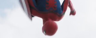
He's back! Again!
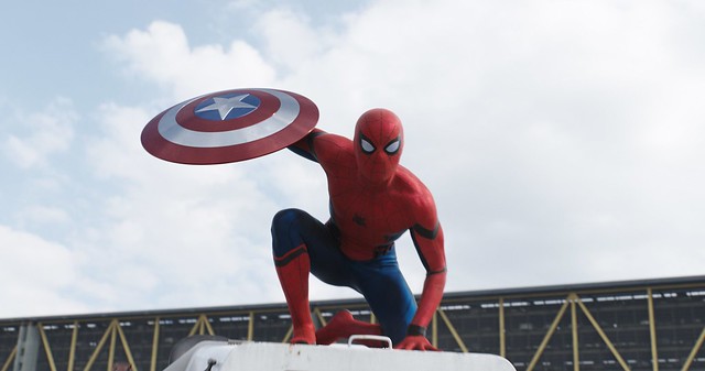
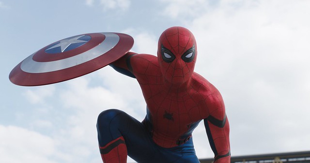
There’s been a lot of buzz going around the interwebs about the latest Captain America: Civil War trailer, primarily because of the surprise appearance of our friendly neighborhood Spider-man. But just like Zoolander 2’s humor and Ben Affleck’s Batman casting, Spidey’s new, rebooted look was received with mixed emotions. Some like it (the fact that he even APPEARS on the trailer is enough to wet people’s loins), and other are just ‘meh’ and still prefer the Andrew Garfield’s Spidey uniform. (Eherm, present company included.)
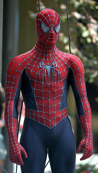

Raimi and Webb's (ASM 2) Spider-men. (With very noticeable differences in head shape.)
There are very stark contrasts between the Raimi and ‘Amazing’ Spider-suits with MCU’s version. Probably one of the more obvious and talked about distinctions was the smaller, squint-ier eyes. Raimi’s was hard and pointy; ASM 1 used rounder and more modern and sunglass-y looking lenses, while ASM 2’s were much larger and more comic book-like. I admit, I am partial to Webb’s second Spidey mask design. Not only was it fan-pleasingly accurate to Spider-man’s eyes in contemporary comic books, Webb also perfected the shape of Spidey’s head overall. I liked this take’s rounder, larger head. It was a crafty idea to have a sort of shell underneath the mask for contour. The previous and the MCU designs may be more anatomically correct and realistic if someone was to put on a spandex mask over his face, but ASM 2’s version at least doesn’t have that awkward, boxy look. Spider-man always had an elongated, walnut-like head in the comics anyway.


Andrew Garfield - still my favorite Spider-man. (for now, at least.)
Moreover, one would likely notice the distinct lack of suit texture in MCU’s Spidey. Next to the Japanese Supaidaman suit, MCU’s has the least texture and weight on its fabric, whereas both Raimi’s and Webb’s suits looked denser and visually dynamic. In this rebooted costume, the thread art and layering were toned down to the point that it almost looks like a light wetsuit. (Yes, there’s still some texture if you look close enough.)

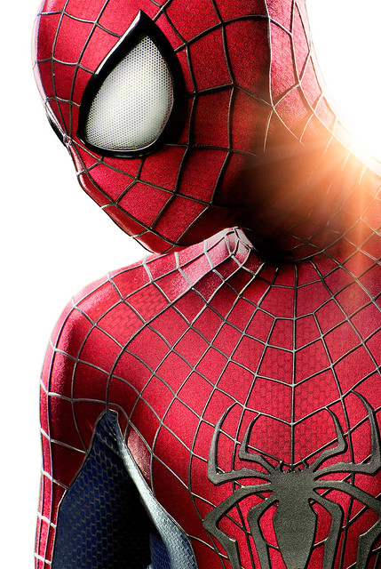
ASM 1 and 2 - the lenses, texture, Spider logo all differ from one suit to another.
But before you get your panties in a bunch and start trolling the internet and spreading your hate, you should know that there could be a good reason why MCU decided to make their Spidey look the way it does; a very calculated reason. Comic nerds would immediately recognize that the Civil War uniform was heavily inspired by Spider-man’s earliest iterations. Those squinty eyes were part Steve Ditko, the creator of Spider-man, and part John Romita Sr., the artist who takes over after Ditko. The coolest moment of seeing webhead during the Civil War trailer was when his lenses sudddenly to buzz and contract, going from Romita eyes to Ditko eyes! Unlike any other spider suit before, MCU’s Spider-man lenses are mechanical! I imagine nerds across the globe flipping their collective lids!!! This could potentially mean that Spider-man’s eyes in the MCU will be able to show emotion! (...or just do the contracting thing and I’m just blowing this out of proportion.)
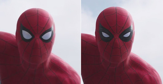
How cool would it be if Spider-man could show a range of emotions through these lenses??


Spider-man's new eyes go from Romita eyes to Ditko eyes.
The small spider emblem on his chest and the stubby, red spider on his back were also from the Ditko original concepts. In both its emblems and the fabric, MCU Spidey is proving to be the least showy among all the cinematic Spider-men.

'Amazing' back and 'Marvelous' back.


Romita and Ditko designs, respectively. I'd say MCU's back more Romita than Ditko.
The exposed web shooter and cartridge belt and the shoulder and elbow bands are new; I guess an attempt at adding a distinction from the classic design. Whether it’s functional or purely aesthetic remains to be seen.
But the point is, the classic inspiration to this particular Spider-man incarnation is actually perfect, if you think about where he is in his career. In an interview with Marvel exec’s, we find out that this wall-crawler is still a teenager, a high schooler, and has only been in the superhero business for a year or so. He’s young and very new at this gig and is likely looking to the adult heroes for guidance. And what better way to accentuate a Spidey who’s starting out that to give him the look that originally launched his career on printed media? The classic suit subtly exemplifies a neophyte Spider-man –a new Spider-man, a still a work in progress Spider-man. Who knows, maybe down the road we eventually get to see a more contemporary look. Or maybe, (and I hope) we see him don his Iron Spider suit that Tony fashions for him in the comics! (#spideyonteamstark!)
I still can't believe it's happening...SPIDER-MAN WITH THE AVENGERS!!! Let's take a moment to appreciate that again.:)
Whether or not that makes this costume better than Webb’s ASM 2 suit is still up for debate, but it certainly puts it in a much better light, and me, in a more appreciative position. But in the end, whatever preferences we may have for our friendly neighborhood Spider-man’s look, it still all comes down to how he’s portrayed in the upcoming movie. Here’s hoping Marvel will be able to give the character justice and build up a stronger, more kick-ass Spidey franchise!
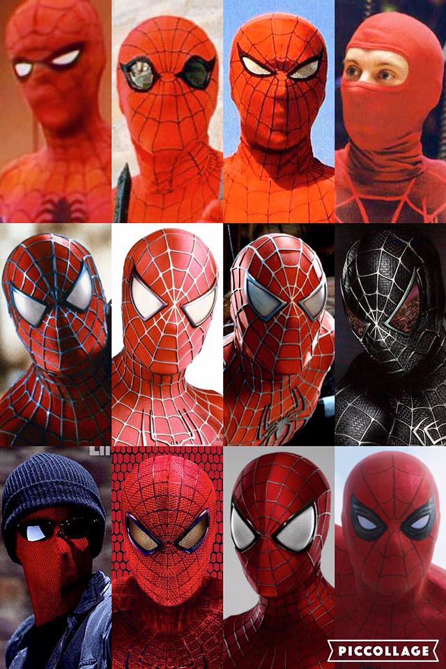
Spider-man's many live-action faces.
No comments:
Post a Comment